Project overview
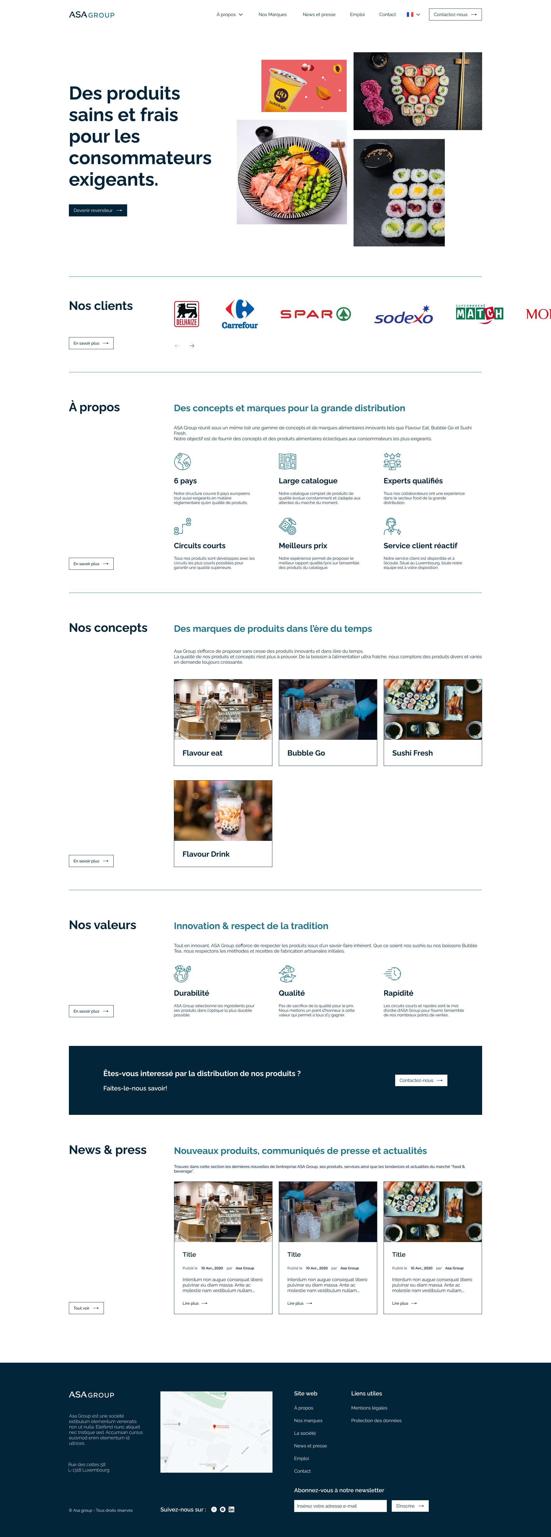
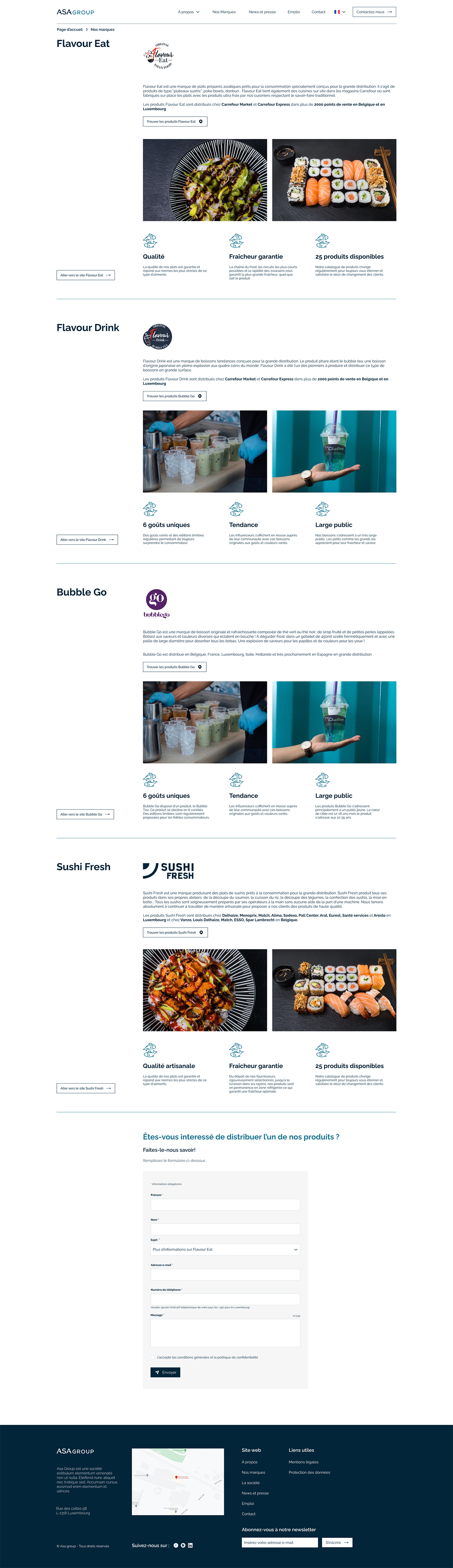
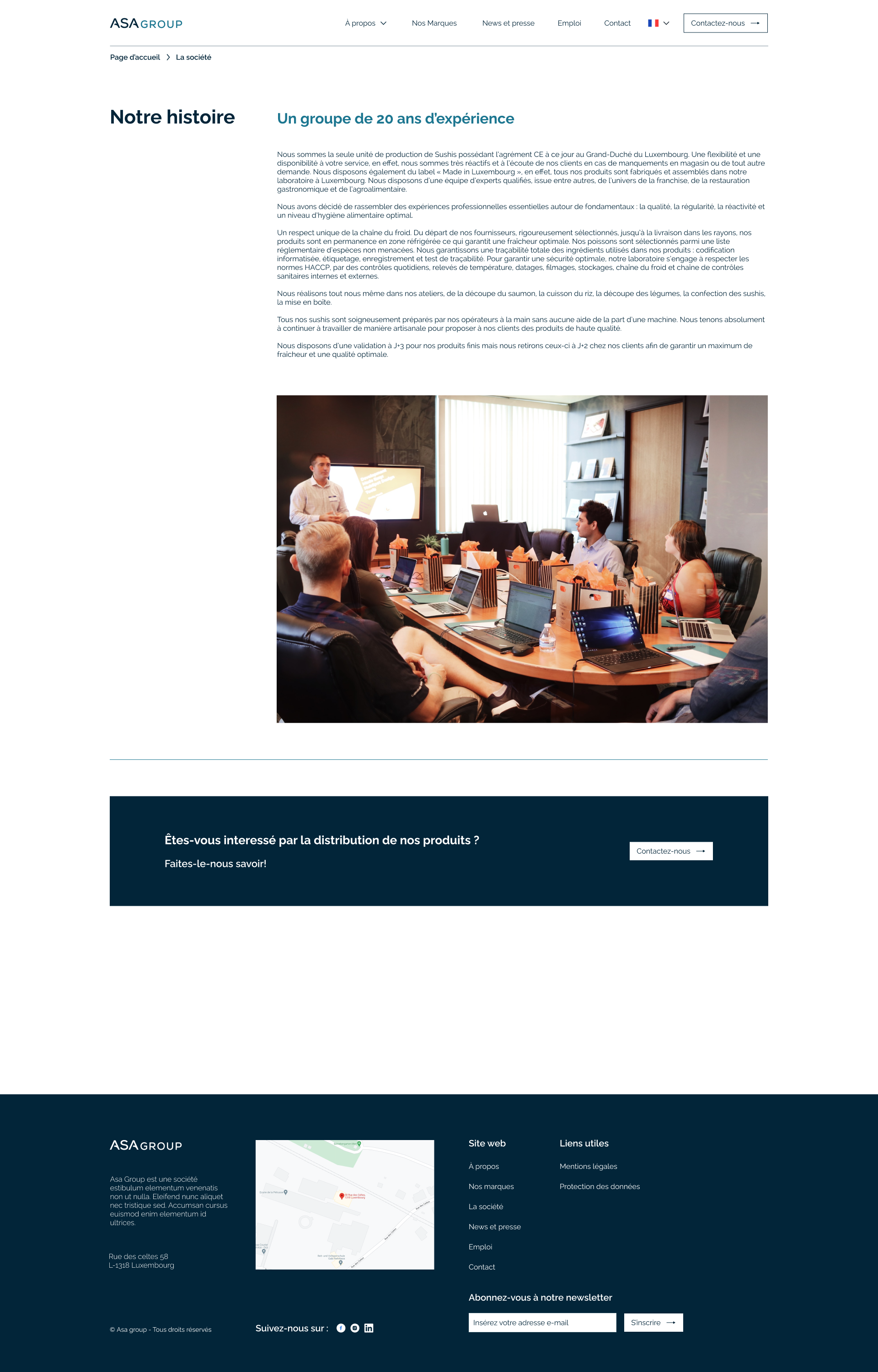
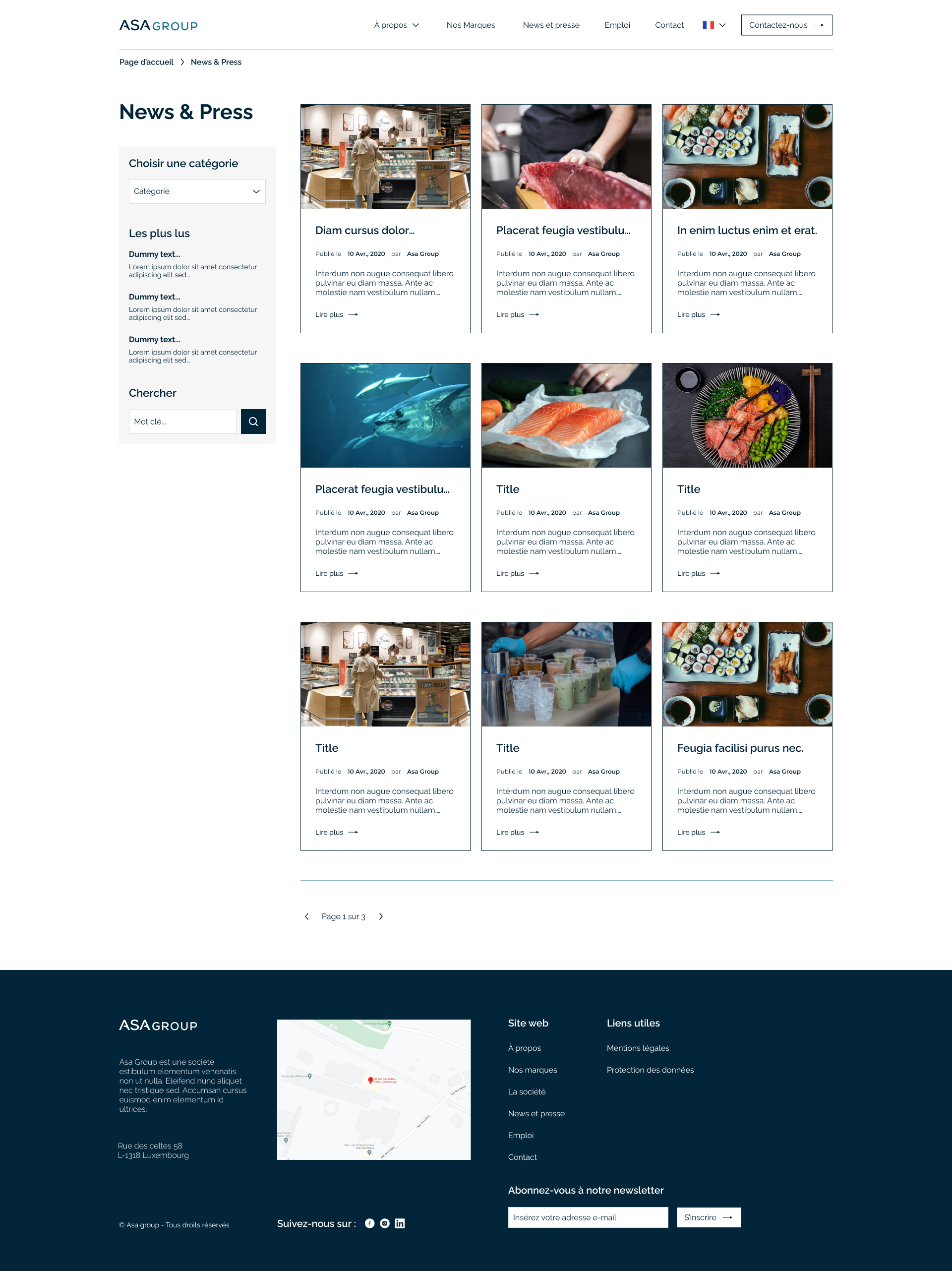
ASA Group is a food and beverage distribution company that operates in multiple European countries. The company identified a need for an online platform to attract new distributors. The website is designed to showcase the brands available for distribution, the company's values and commitments, a contact form, and other pertinent information for users.
Problems:
- It is relatively difficult (or even impossible) to find ASA Group and its brands on the internet for potential new or existing customers who are looking for information.
- ASA Group doesn't have a visual identity.
Goals:
- Create the brand identity and all relevant visual materials.
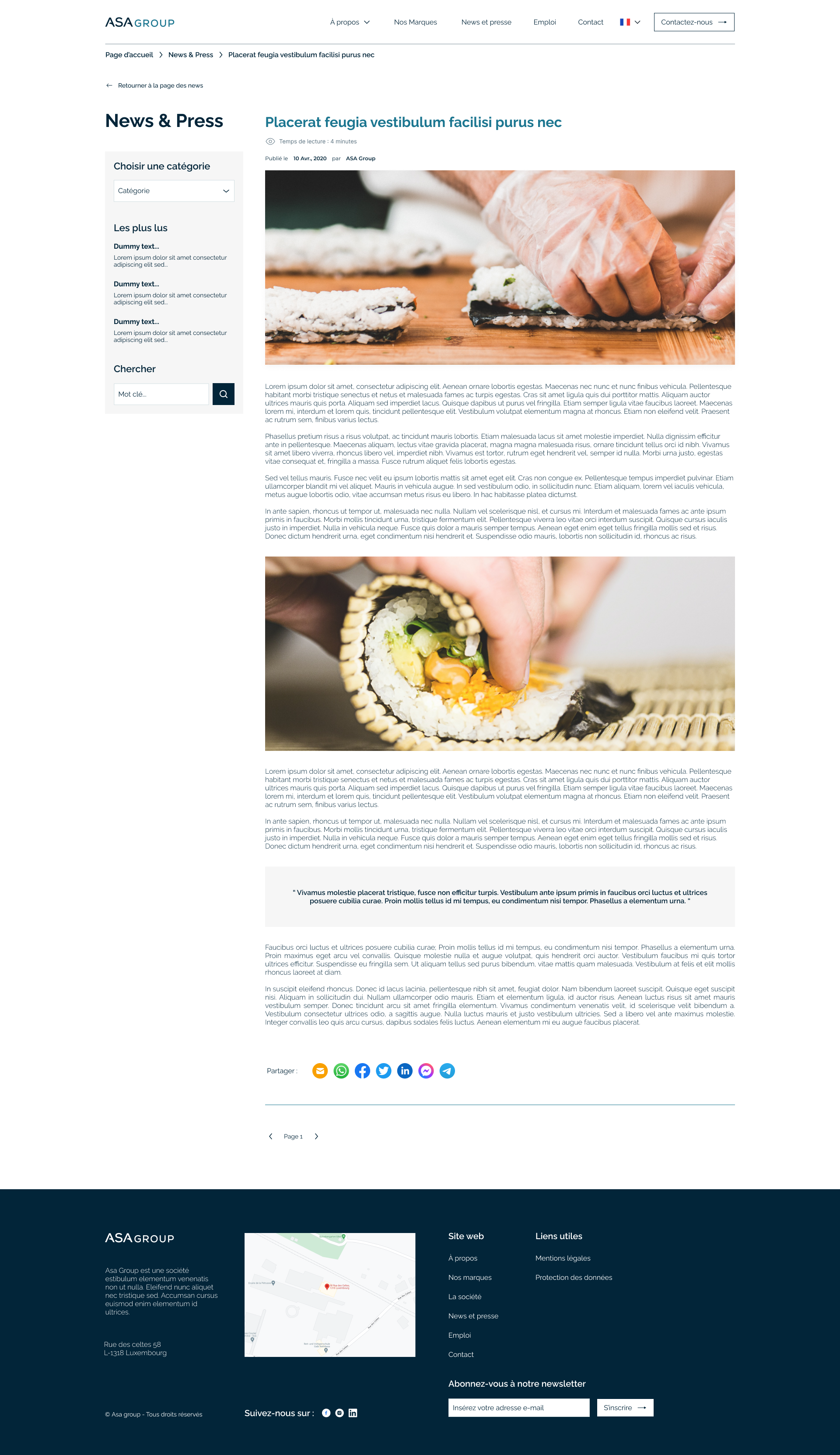
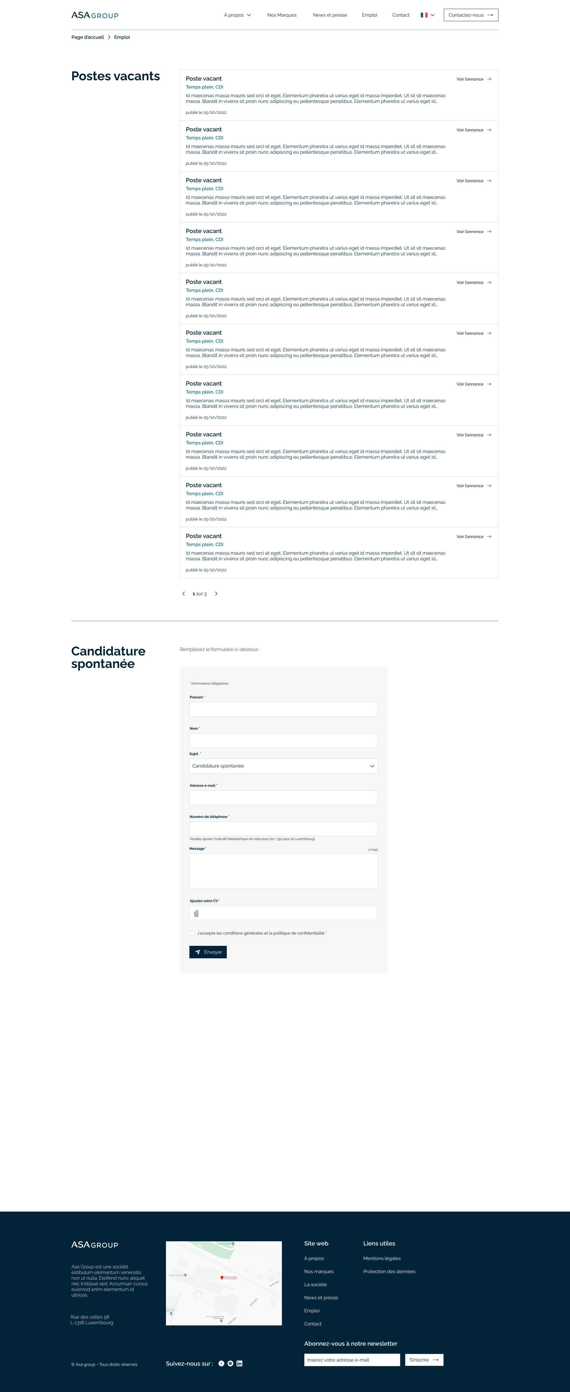
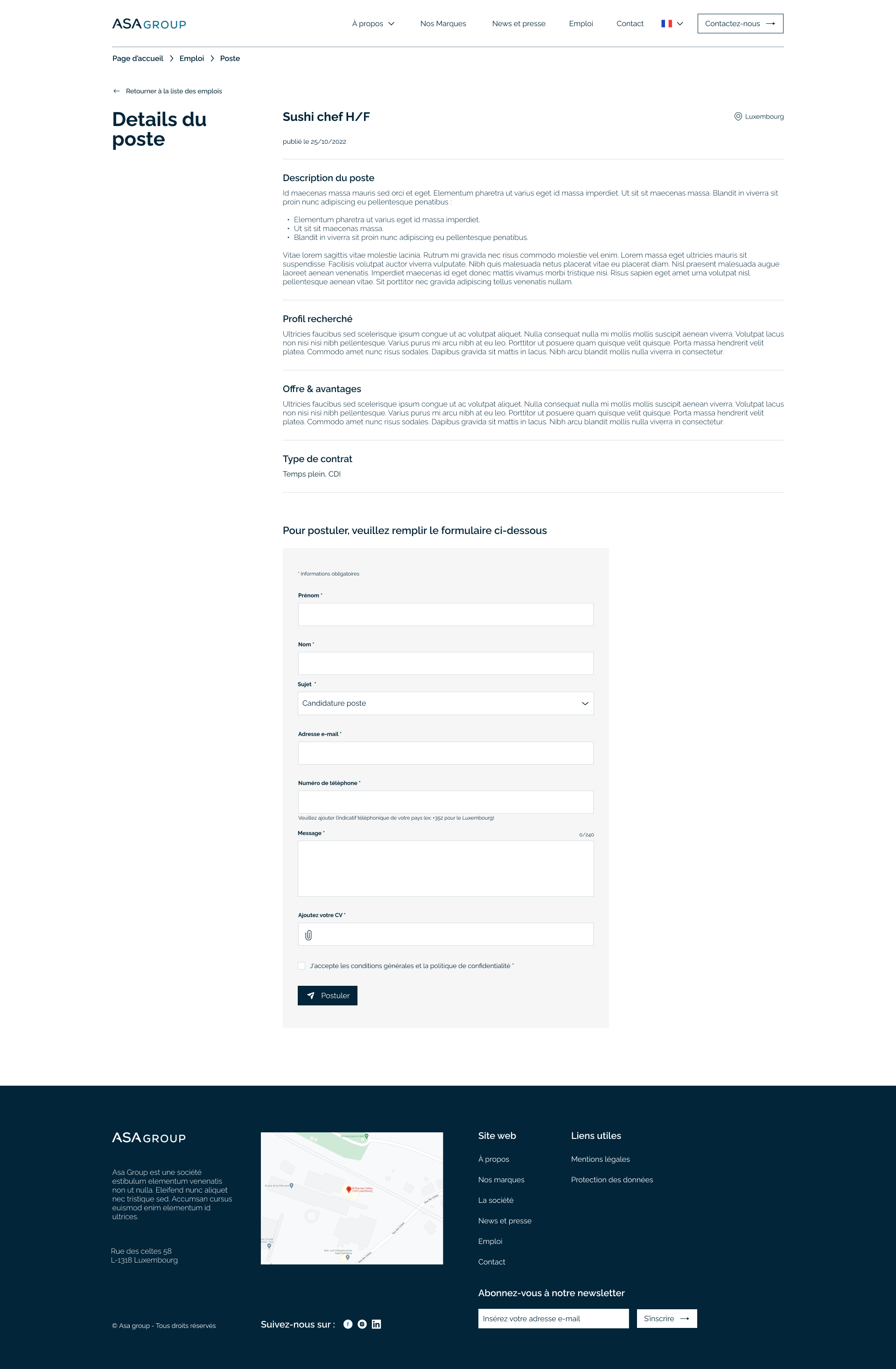
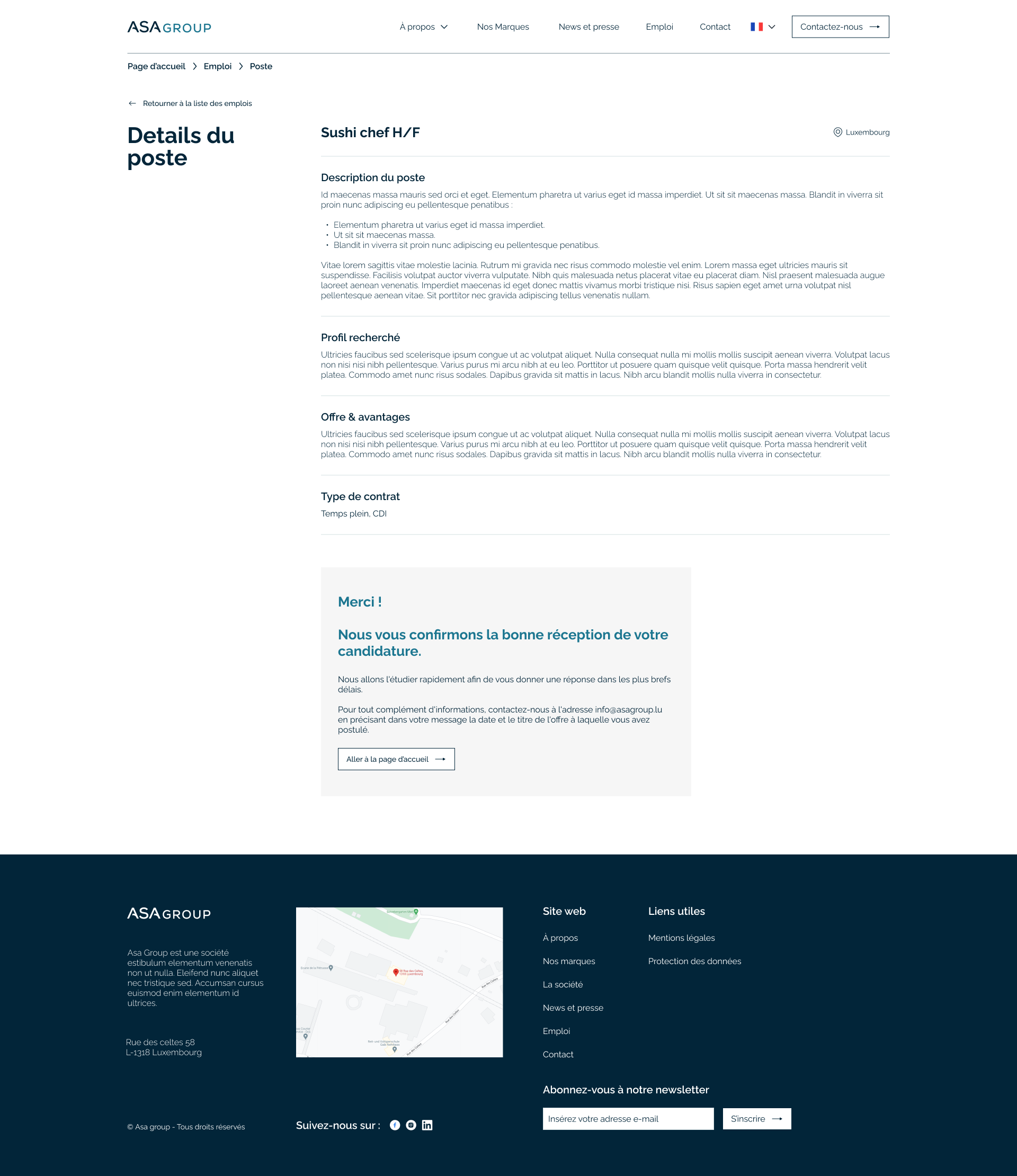
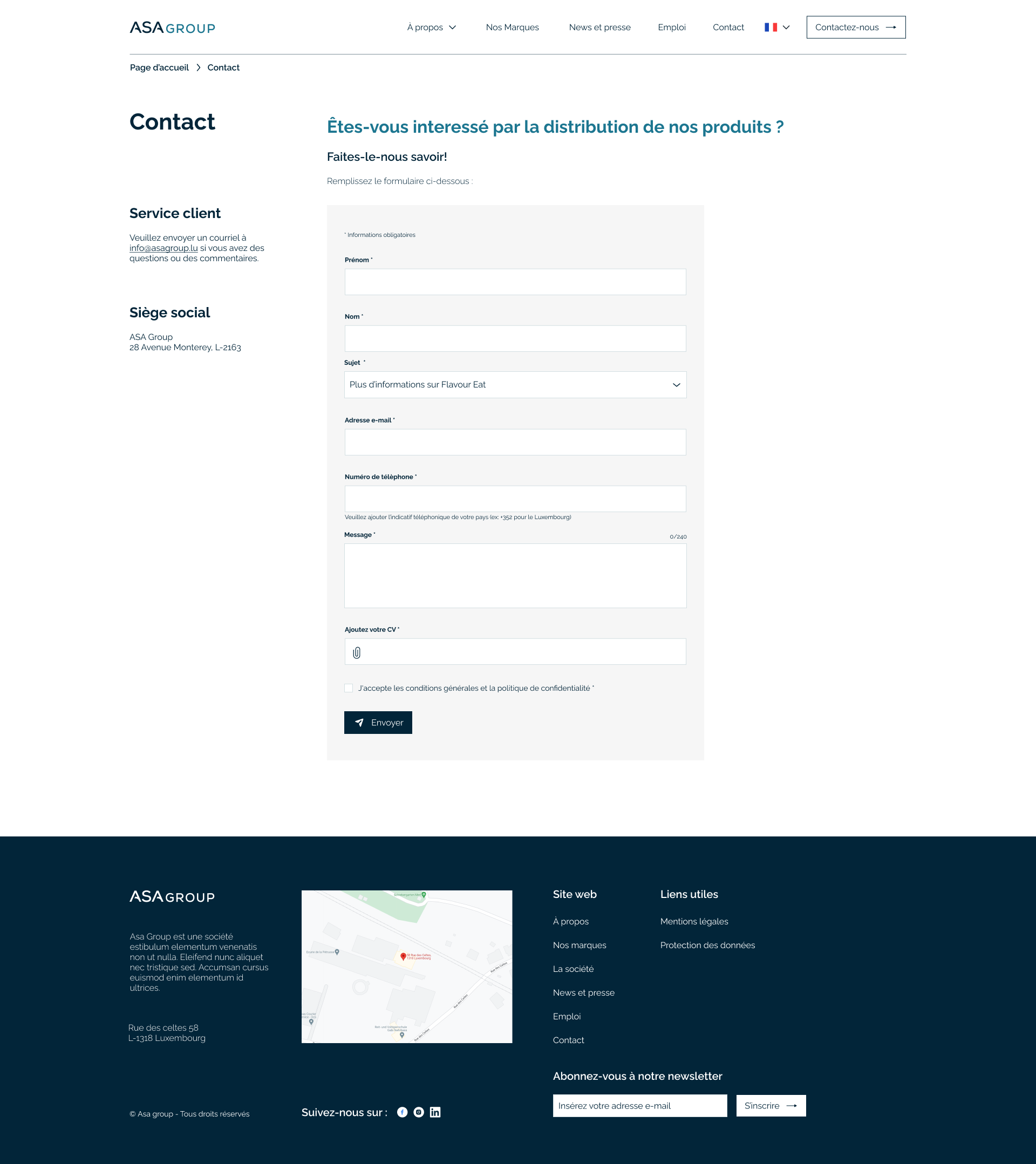
- Design a modern and minimalist corporate website.
- Make sure that the content od the website is easily changeable by anyone with internal and external access.
- Based on Wordpress, the site must be simple, efficient and effective.
Services
Custom graphics / UX design / UI design
Tools used
Hand sketching / Illustrator / Photoshop / Figma
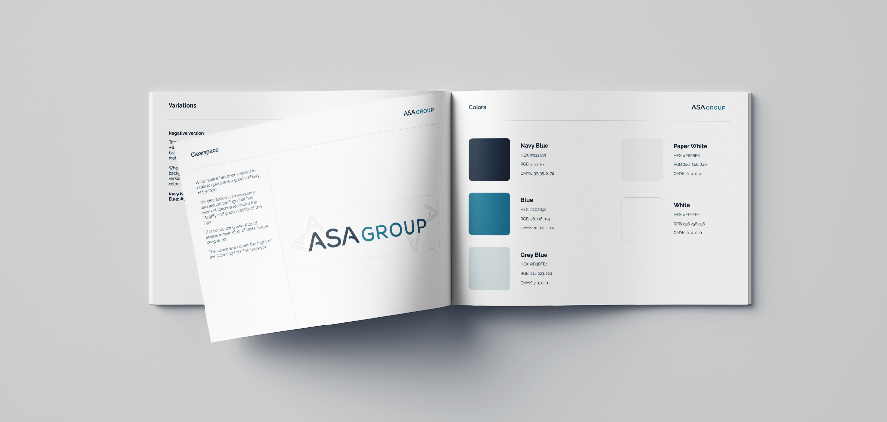
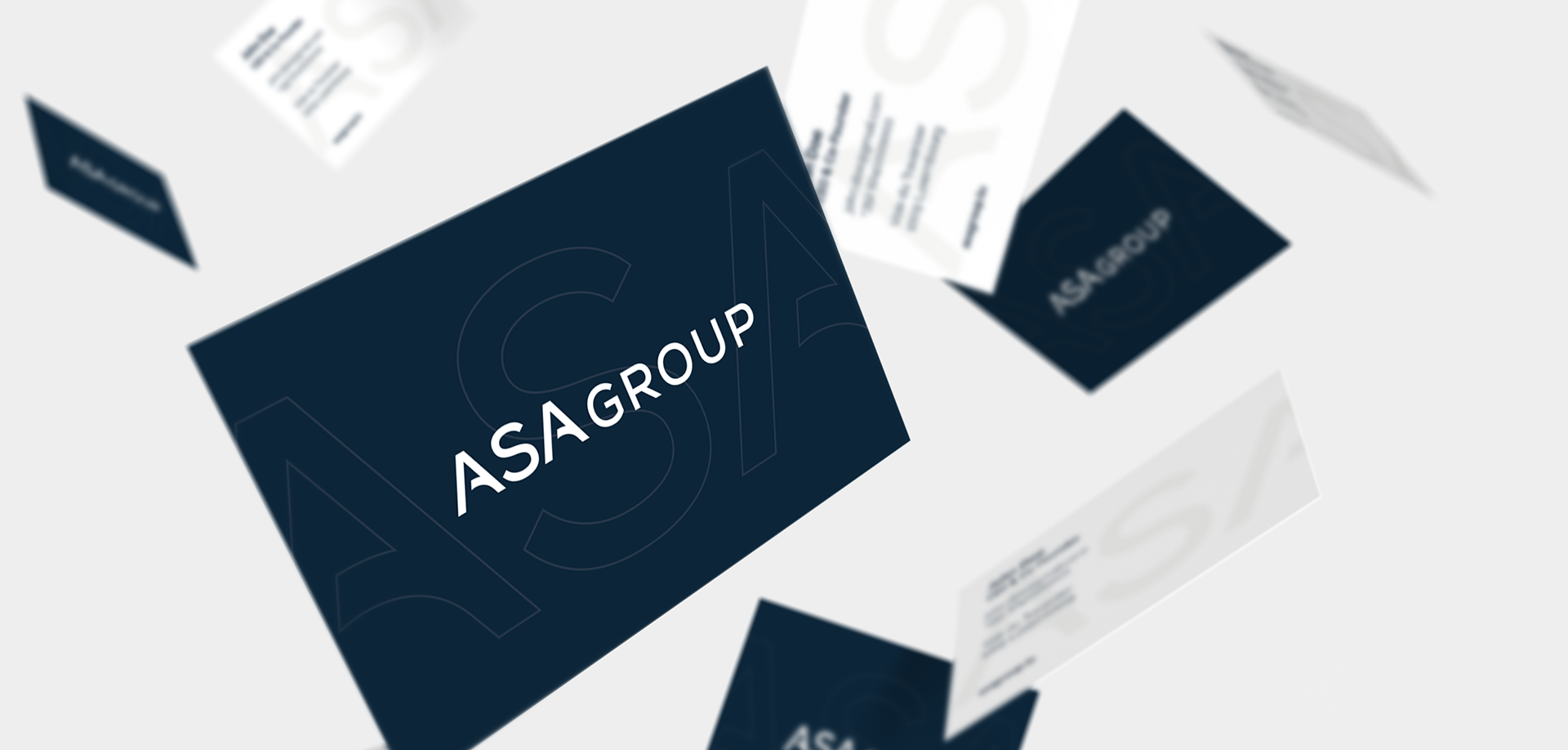
Brand identity
I interviewed the client, analyzed competitors, defined the target audience, created a moodboard and sketched some ideas
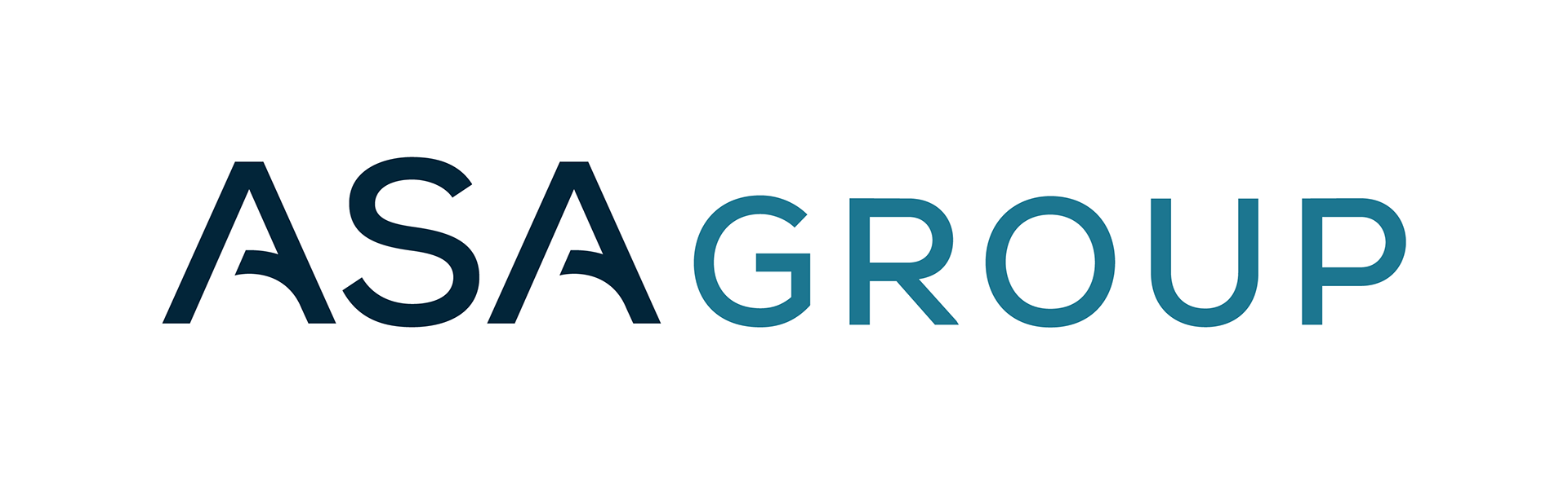
In conceptualizing the logo, I distilled the essence of their brand into a clean and minimalist design. Stripping away the unnecessary, I focused on delivering a visually refined and straightforward logo, ensuring it resonates with the company's desire for an understated yet impactful brand identity.
The result is a minimalistic corporate logo that effortlessly convey elegance and modern feel.
UX/UI design
Stakeholders interview, competitor analysis & personas
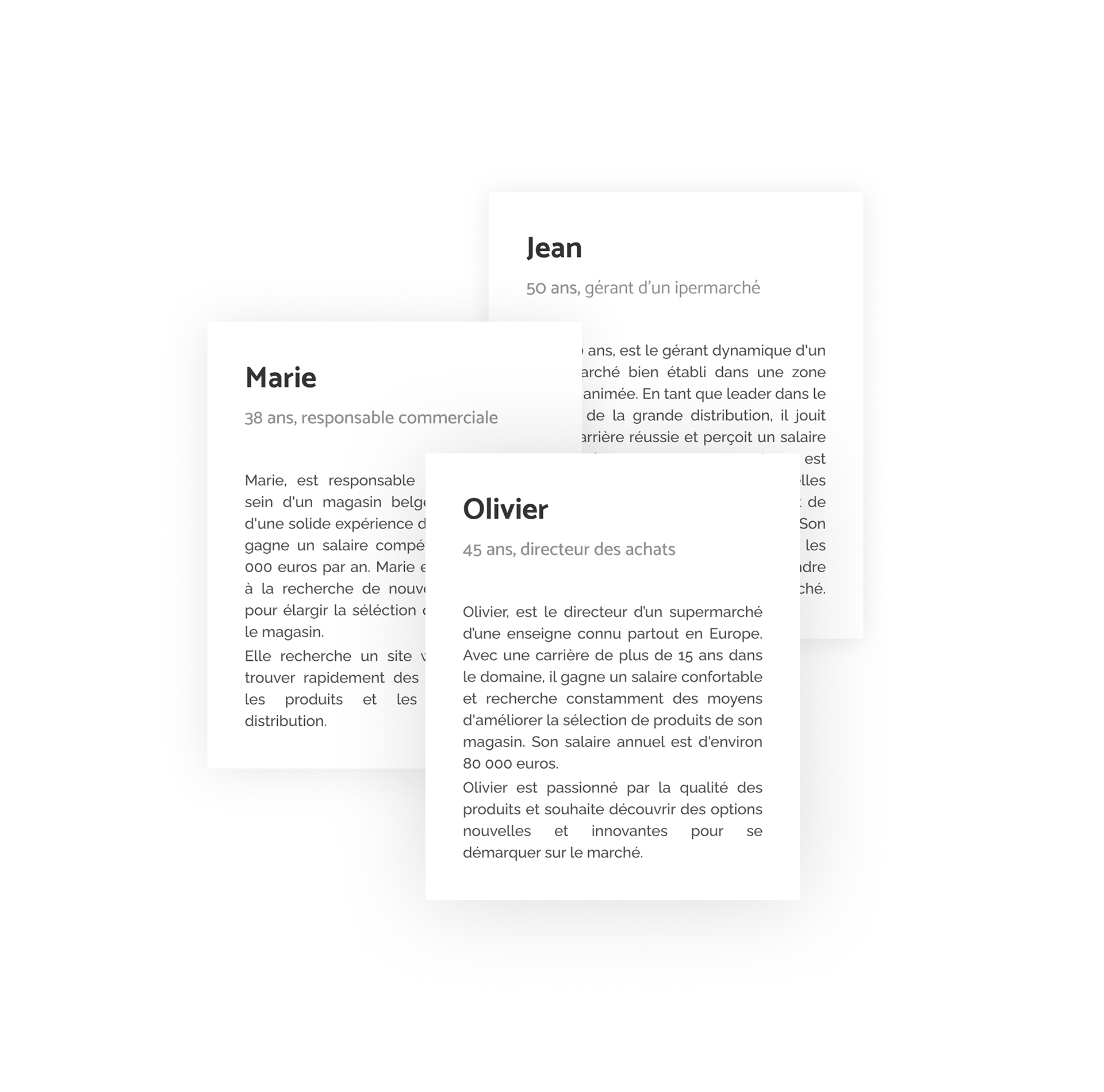
During the ideation phase of the project, I prepared with the product owner, an interview for the stakeholders to allow me to build new personas and to inform the design.
We prepared an interview script with 15 open-ended questions, focusing on the company goals, target audience and business values.
I referenced the user interview findings throughout the entire design process.
Based on stakeholders interview and competitive analysis, I created personas that represents a sales manager, a store director and a sales director.
These personas served as a guiding reference throughout the creation of wireframes and mid-fidelity mockups, ensuring that the design process remained user-centric.
Due to the goal of the project, a showcase website, there were not many challenges in terms of UX so I focused more on the information architecture and how to best present the company and its values. And that’s why I opted to use low fidelity wireframes on paper as a first approach.
Design system
I then proceded to create a design system with components and icons.
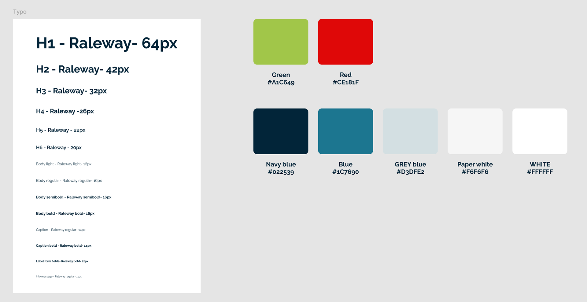
Fonts and colors

Tile animation
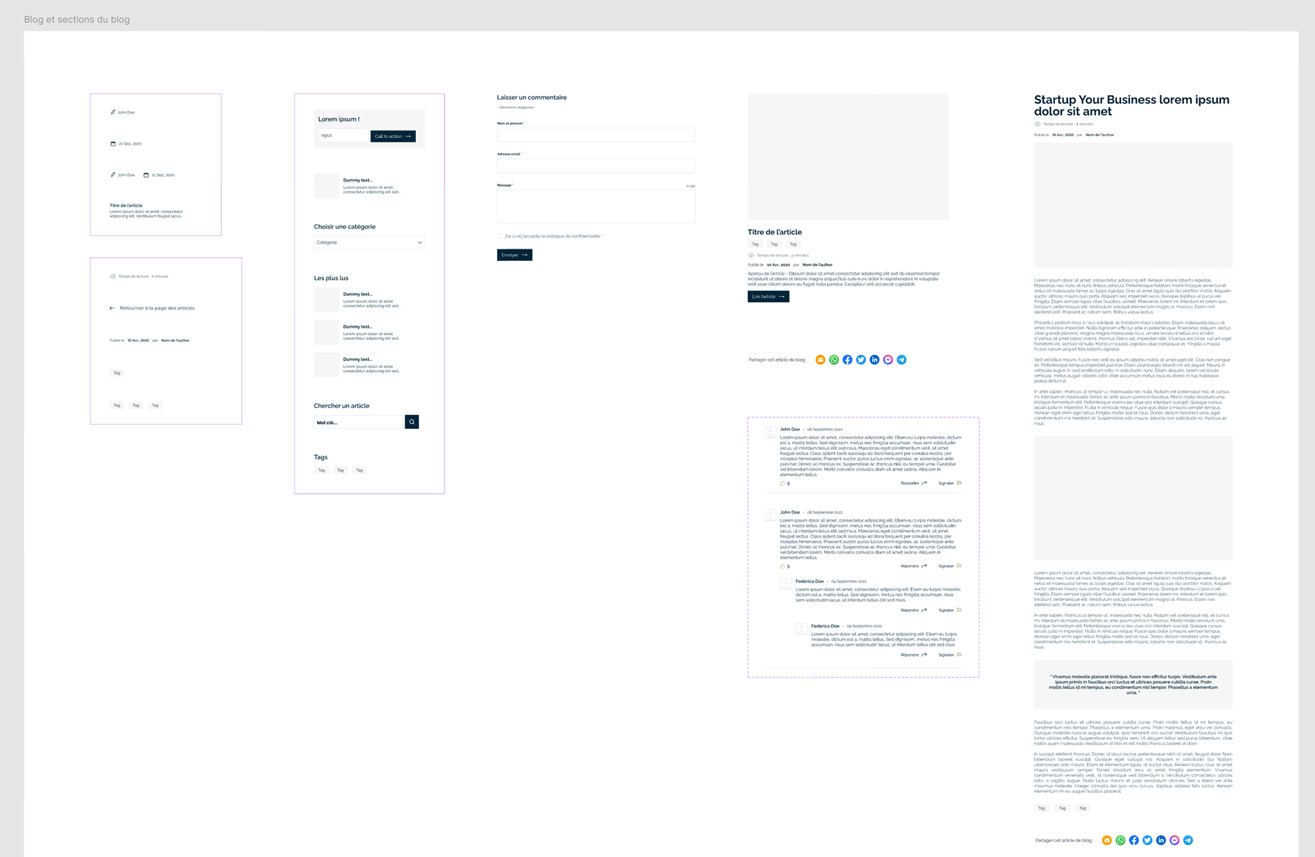
Blog page system
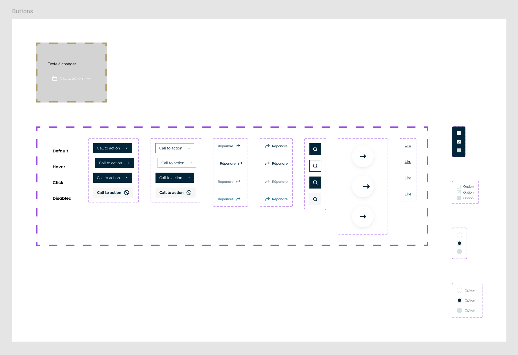
Buttons UI and interactions
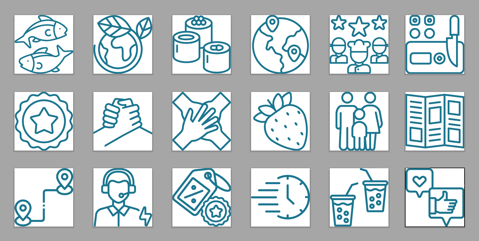
Iconography
The iconography system is rooted in geometric and minimalistic forms. It’s always reduced to the simpest way to communicate the subject matter possible
Wireframes
Prototype
Challenges
- Remote, international team that had poor communication on prioritizing which parts needed to be completed first.
- The stakeholders didn't have many requests or specific ideas regarding how the site should look, except for it to be clean and corporate. So, before creating any wireframes, I assembled a moodboard to convey my vision for their site. This ensured that I didn't encounter drastic changes later in terms of UX/UI design.
- I was the only designer and owned the design process so I had to pay extra attention to details, how things flowed, making sure other team members understood the designs, and listening to any feedback to make the right judgement calls before finalizing screens.